

12.1 Graphical Representation of Data
One picture is better than a thousand words. Usually comparisons among the individual items are best shown by means of graphs. The representation then becomes easier to understand Statistics.
We shall study the following graphical representations in this section:
- Bar graphs
- Histograms of uniform width and varying widths
- Frequency polygons
Bar Graphs
A bar graph is a pictorial representation of data in which usually bars of uniform width are drawn with equal spacing between them on one axis (say, the x-axis), depicting the variable. The values of the variable are shown on the other axis (say, the y-axis) and the heights of the bars depend on the values of the variable.
Example 1
In a particular section of Class IX, 40 students were asked about the months of their birth and the following graph was prepared for the data so obtained.
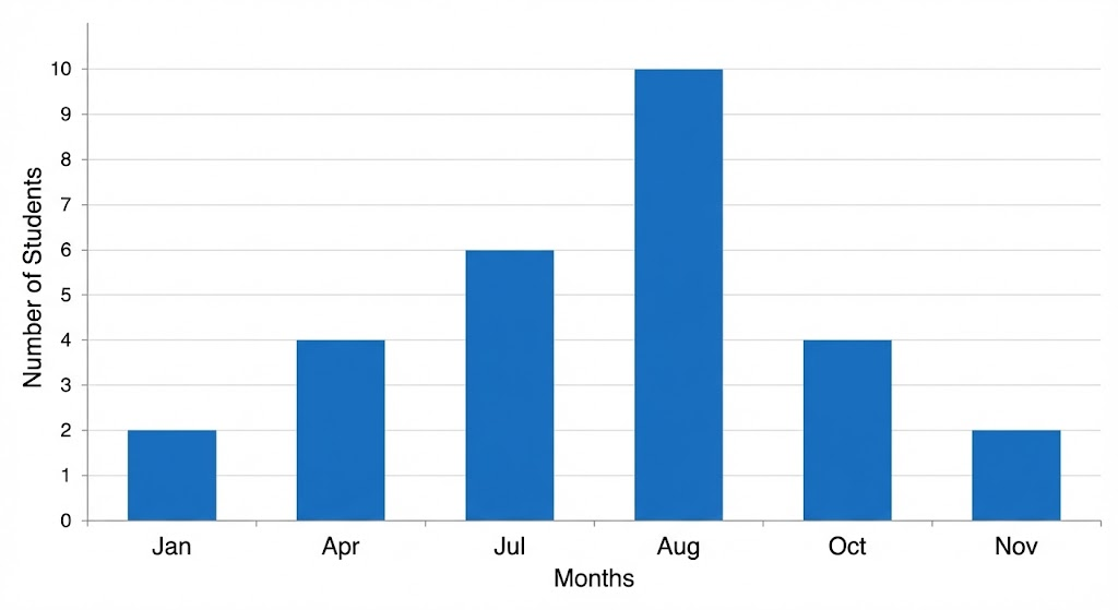
Questions: (i) How many students were born in the month of November? (ii) In which month were the maximum number of students born?
Solution:
Note that the variable here is the ‘month of birth’, and the value of the variable is the ‘Number of students born’.
(i) 4 students were born in the month of November.
(ii) The maximum number of students were born in the month of August.
Example 2
A family with a monthly income of ₹20,000 had planned the following expenditures per month under various heads:
| Heads | Expenditure (in thousand rupees) |
|---|---|
| Grocery | 4 |
| Rent | 5 |
| Education of children | 5 |
| Medicine | 2 |
| Fuel | 2 |
| Entertainment | 1 |
| Miscellaneous | 1 |
Draw a bar graph for the data above.
Solution:
We draw the bar graph of this data in the following steps. Note that the unit in the second column is thousand rupees. So, ‘4’ against ‘grocery’ means ₹4000.
- We represent the Heads (variable) on the horizontal axis choosing any scale, since the width of the bar is not important. But for clarity, we take equal widths for all bars and maintain equal gaps in between. Let one Head be represented by one unit.
- We represent the expenditure (value) on the vertical axis. Since the maximum expenditure is ₹5000, we can choose the scale as 1 unit = ₹1000.
- To represent our first Head, i.e., grocery, we draw a rectangular bar with width 1 unit and height 4 units.
- Similarly, other Heads are represented leaving a gap of 1 unit in between two consecutive bars.
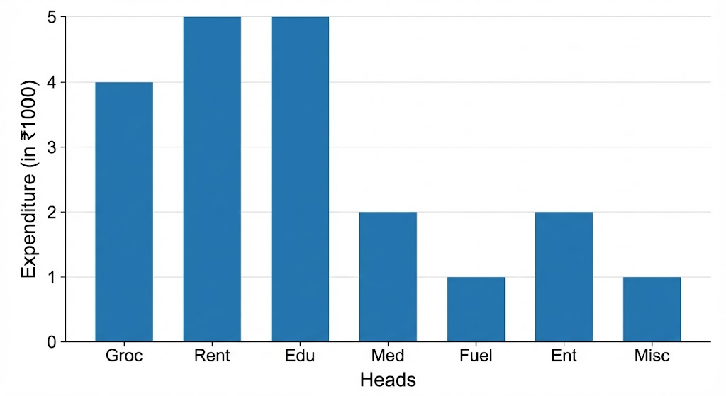
Here, you can easily visualise the relative characteristics of the data at a glance. For example, the expenditure on education is more than double that of medical expenses. Therefore, in some ways it serves as a better representation of data than the tabular form.
Histogram
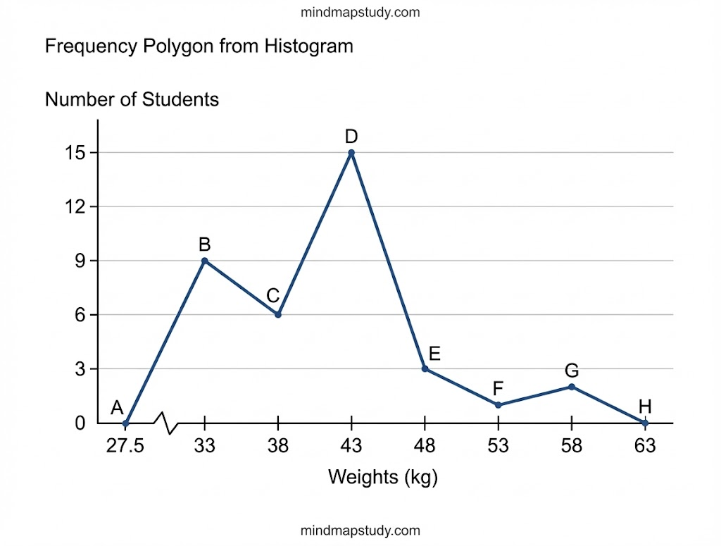
This is a form of representation like the bar graph, but it is used for continuous class intervals. Consider the frequency distribution table representing the weights of 36 students of a class:
| Weights (in kg) | Number of students |
|---|---|
| 30.5 – 35.5 | 9 |
| 35.5 – 40.5 | 6 |
| 40.5 – 45.5 | 15 |
| 45.5 – 50.5 | 3 |
| 50.5 – 55.5 | 1 |
| 55.5 – 60.5 | 2 |
| Total | 36 |
Let us represent the data given above graphically as follows:
(i) We represent the weights on the horizontal axis on a suitable scale. We can choose the scale as 1 cm = 5 kg. Also, since the first class interval is starting from 30.5 and not zero, we show it on the graph by marking a kink or a break on the axis.
(ii) We represent the number of students (frequency) on the vertical axis on a suitable scale. Since the maximum frequency is 15, we need to choose the scale to accommodate this maximum frequency.
(iii) We now draw rectangles (or rectangular bars) of width equal to the class-size and lengths according to the frequencies of the corresponding class intervals.
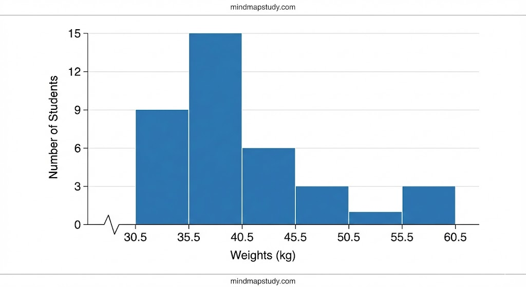
Observe that since there are no gaps in between consecutive rectangles, the resultant graph appears like a solid figure. This is called a histogram, which is a graphical representation of a grouped frequency distribution with continuous classes. Also, unlike a bar graph, the width of the bar plays a significant role in its construction.
Here, in fact, areas of the rectangles erected are proportional to the corresponding frequencies. However, since the widths of the rectangles are all equal, the lengths of the rectangles are proportional to the frequencies.
Example 3
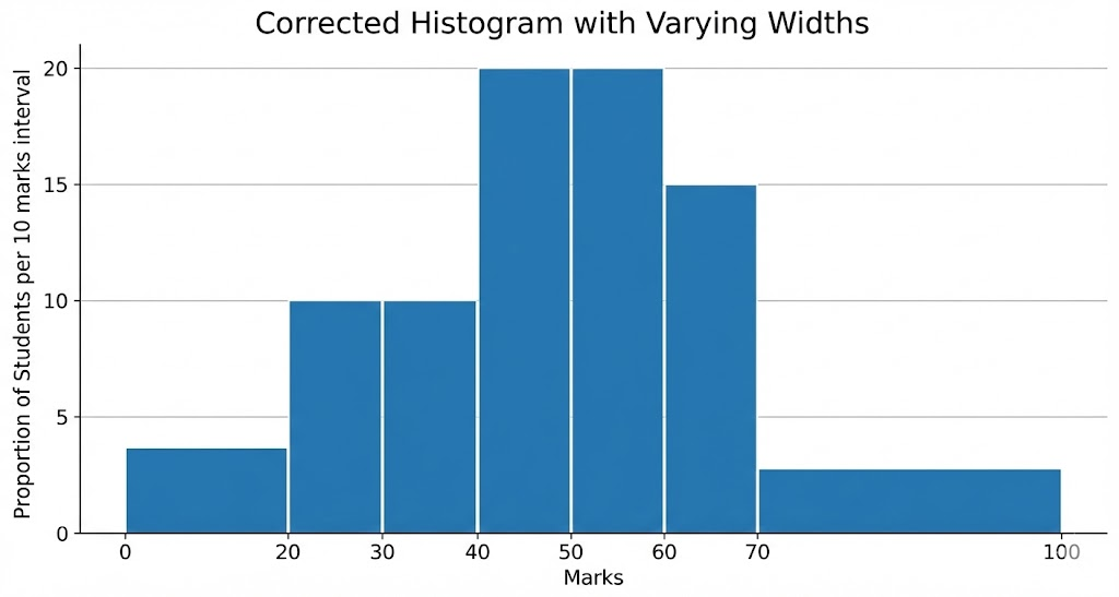
A teacher wanted to analyse the performance of two sections of students in a mathematics test of 100 marks. Looking at their performances, she found that a few students got under 20 marks and a few got 70 marks or above. So she decided to group them into intervals of varying sizes as follows: 0 – 20, 20 – 30, …, 60 – 70, 70 – 100. Then she formed the following table:
| Marks | Number of students |
|---|---|
| 0 – 20 | 7 |
| 20 – 30 | 10 |
| 30 – 40 | 10 |
| 40 – 50 | 20 |
| 50 – 60 | 20 |
| 60 – 70 | 15 |
| 70 – above | 8 |
| Total | 90 |
When drawing a histogram with varying class widths, we need to make modifications in the lengths of the rectangles so that the areas are proportional to the frequencies.
The steps to be followed are:
- Select a class interval with the minimum class size. In the example above, the minimum class-size is 10.
- The lengths of the rectangles are then modified to be proportionate to the class-size 10.
For instance, when the class-size is 20, the length of the rectangle is 7. So when the class-size is 10, the length of the rectangle will be (7/20) × 10 = 3.5.
Similarly, proceeding in this manner, we get the following table:
| Marks | Frequency | Width of the class | Length of the rectangle |
|---|---|---|---|
| 0 – 20 | 7 | 20 | (7/20) × 10 = 3.5 |
| 20 – 30 | 10 | 10 | (10/10) × 10 = 10 |
| 30 – 40 | 10 | 10 | (10/10) × 10 = 10 |
| 40 – 50 | 20 | 10 | (20/10) × 10 = 20 |
| 50 – 60 | 20 | 10 | (20/10) × 10 = 20 |
| 60 – 70 | 15 | 10 | (15/10) × 10 = 15 |
| 70 – 100 | 8 | 30 | (8/30) × 10 = 2.67 |
Since we have calculated these lengths for an interval of 10 marks in each case, we may call these lengths as “proportion of students per 10 marks interval”.
Frequency Polygon
There is yet another visual way of representing quantitative data and its frequencies. This is a polygon. To see what we mean, consider a histogram and join the mid-points of the upper sides of the adjacent rectangles by means of line segments.
To complete the polygon, we assume that there is a class interval with frequency zero before the first class interval, and one after the last class interval. This enables us to make the area of the frequency polygon the same as the area of the histogram.
Example 4
Consider the marks, out of 100, obtained by 51 students of a class in a test, given below:
| Marks | Number of students |
|---|---|
| 0 – 10 | 5 |
| 10 – 20 | 10 |
| 20 – 30 | 4 |
| 30 – 40 | 6 |
| 40 – 50 | 7 |
| 50 – 60 | 3 |
| 60 – 70 | 2 |
| 70 – 80 | 2 |
| 80 – 90 | 3 |
| 90 – 100 | 9 |
| Total | 51 |
Draw a frequency polygon corresponding to this frequency distribution table.
Solution:
Let us first draw a histogram for this data and mark the mid-points of the tops of the rectangles. Here, the first class is 0-10. So, to find the class preceding 0-10, we extend the horizontal axis in the negative direction and find the mid-point of the imaginary class-interval (-10) – 0.
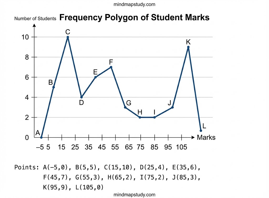
Frequency polygons can also be drawn independently without drawing histograms. For this, we require the mid-points of the class-intervals used in the data. These mid-points of the class-intervals are called class-marks.
To find the class-mark of a class interval, we find the sum of the upper limit and lower limit of a class and divide it by 2. Thus,
Class-mark = (Upper limit + Lower limit) / 2
Example 5
In a city, the weekly observations made in a study on the cost of living index are given in the following table:
| Cost of living index | Number of weeks |
|---|---|
| 140 – 150 | 5 |
| 150 – 160 | 10 |
| 160 – 170 | 20 |
| 170 – 180 | 9 |
| 180 – 190 | 6 |
| 190 – 200 | 2 |
| Total | 52 |
Draw a frequency polygon for the data above (without constructing a histogram).
Solution:
Since we want to draw a frequency polygon without a histogram, let us find the class-marks of the classes given above.
For 140 – 150, the upper limit = 150, and the lower limit = 140
So, the class-mark = (150 + 140) / 2 = 290 / 2 = 145
Continuing in the same manner:
| Classes | Class-marks | Frequency |
|---|---|---|
| 140 – 150 | 145 | 5 |
| 150 – 160 | 155 | 10 |
| 160 – 170 | 165 | 20 |
| 170 – 180 | 175 | 9 |
| 180 – 190 | 185 | 6 |
| 190 – 200 | 195 | 2 |
| Total | 52 |
We can now draw a frequency polygon by plotting the class-marks along the horizontal axis, the frequencies along the vertical axis, and then plotting and joining the points by line segments.
We should not forget to plot the point corresponding to the class-mark of the class 130 – 140 (just before the lowest class 140 – 150) with zero frequency, and the point corresponding to 200 – 210 immediately after the last class.
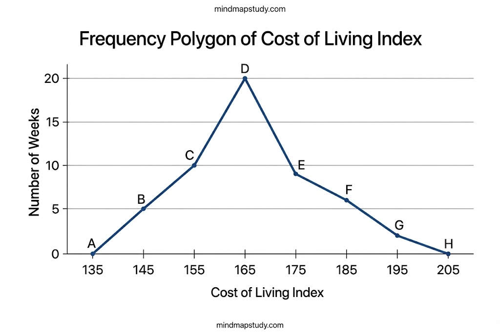
Frequency polygons are used when the data is continuous and very large. It is very useful for comparing two different sets of data of the same nature, for example, comparing the performance of two different sections of the same class.
EXERCISE 12.1
Question 1
A survey conducted by an organisation for the cause of illness and death among the women between the ages 15 – 44 (in years) worldwide, found the following figures (in %):
| S.No. | Causes | Female fatality rate (%) |
|---|---|---|
| 1. | Reproductive health conditions | 31.8 |
| 2. | Neuropsychiatric conditions | 25.4 |
| 3. | Injuries | 12.4 |
| 4. | Cardiovascular conditions | 4.3 |
| 5. | Respiratory conditions | 4.1 |
| 6. | Other causes | 22.0 |
(i) Represent the information given above graphically. (ii) Which condition is the major cause of women’s ill health and death worldwide? (iii) Try to find out, with the help of your teacher, any two factors which play a major role in the cause in (ii) above being the major cause.
Solution:
(i) Bar graph representation:
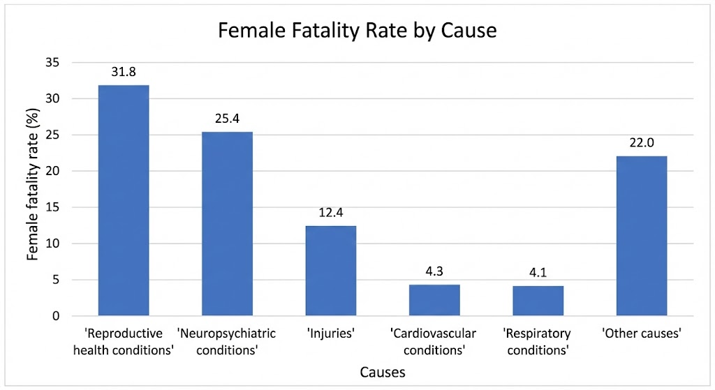
(ii) Reproductive health conditions is the major cause of women’s ill health and death worldwide with 31.8%.
(iii) Two major factors could be:
- Lack of proper healthcare facilities during pregnancy and childbirth
- Inadequate nutrition and healthcare awareness among women
Question 2
The following data on the number of girls (to the nearest ten) per thousand boys in different sections of Indian society is given below:
| Section | Number of girls per thousand boys |
|---|---|
| Scheduled Caste (SC) | 940 |
| Scheduled Tribe (ST) | 970 |
| Non SC/ST | 920 |
| Backward districts | 950 |
| Non-backward districts | 920 |
| Rural | 930 |
| Urban | 910 |
(i) Represent the information above by a bar graph. (ii) In the classroom discuss what conclusions can be arrived at from the graph.
Solution:
(i) Bar graph representation:
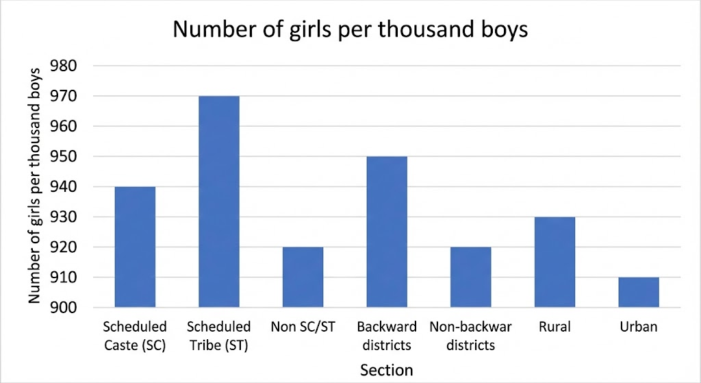
(ii) Conclusions from the graph:
- Scheduled Tribe (ST) has the highest number of girls per thousand boys (970)
- Urban areas have the lowest ratio (910 girls per thousand boys)
- Backward districts have better ratios than non-backward districts
- Rural areas have better ratios than urban areas
- All ratios are below 1000, indicating fewer girls than boys in all sections
Question 3
Given below are the seats won by different political parties in the polling outcome of a state assembly elections:
| Political Party | A | B | C | D | E | F |
|---|---|---|---|---|---|---|
| Seats Won | 75 | 55 | 37 | 29 | 10 | 37 |
(i) Draw a bar graph to represent the polling results. (ii) Which political party won the maximum number of seats?
Solution:
(i) Bar graph representation:
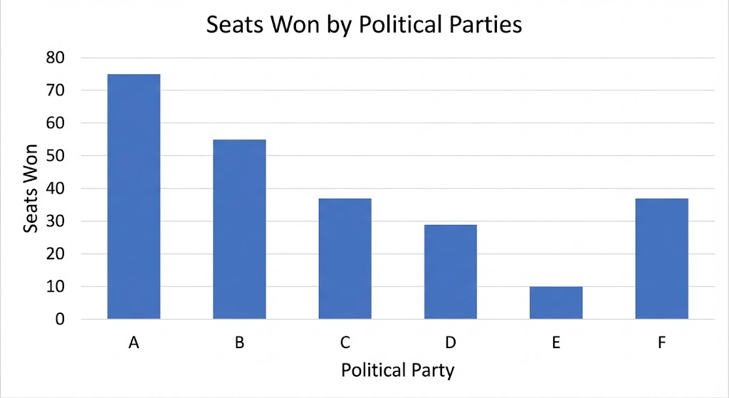
(ii) Political Party A won the maximum number of seats (75 seats).
Question 4
The length of 40 leaves of a plant are measured correct to one millimetre, and the obtained data is represented in the following table:
| Length (in mm) | Number of leaves |
|---|---|
| 118 – 126 | 3 |
| 127 – 135 | 5 |
| 136 – 144 | 9 |
| 145 – 153 | 12 |
| 154 – 162 | 5 |
| 163 – 171 | 4 |
| 172 – 180 | 2 |
(i) Draw a histogram to represent the given data. (ii) Is there any other suitable graphical representation for the same data? (iii) Is it correct to conclude that the maximum number of leaves are 153 mm long? Why?
Solution:
(i) First, we need to make the class intervals continuous. Since the data is measured to one millimetre, the gaps are of 1 mm.
Continuous class intervals:
- 117.5 – 126.5
- 126.5 – 135.5
- 135.5 – 144.5
- 144.5 – 153.5
- 153.5 – 162.5
- 162.5 – 171.5
- 171.5 – 180.5
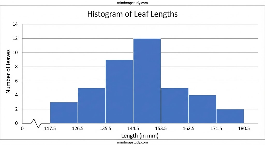
(ii) Yes, a frequency polygon can also be drawn for the same data.
(iii) No, it is not correct to conclude that the maximum number of leaves are 153 mm long. The class 145 – 153 has the maximum frequency of 12 leaves, which means 12 leaves have lengths between 145 mm and 153 mm, not exactly 153 mm.
Question 5
The following table gives the life times of 400 neon lamps:
| Life time (in hours) | Number of lamps |
|---|---|
| 300 – 400 | 14 |
| 400 – 500 | 56 |
| 500 – 600 | 60 |
| 600 – 700 | 86 |
| 700 – 800 | 74 |
| 800 – 900 | 62 |
| 900 – 1000 | 48 |
(i) Represent the given information with the help of a histogram. (ii) How many lamps have a life time of more than 700 hours?
Solution:
(i) Histogram representation:
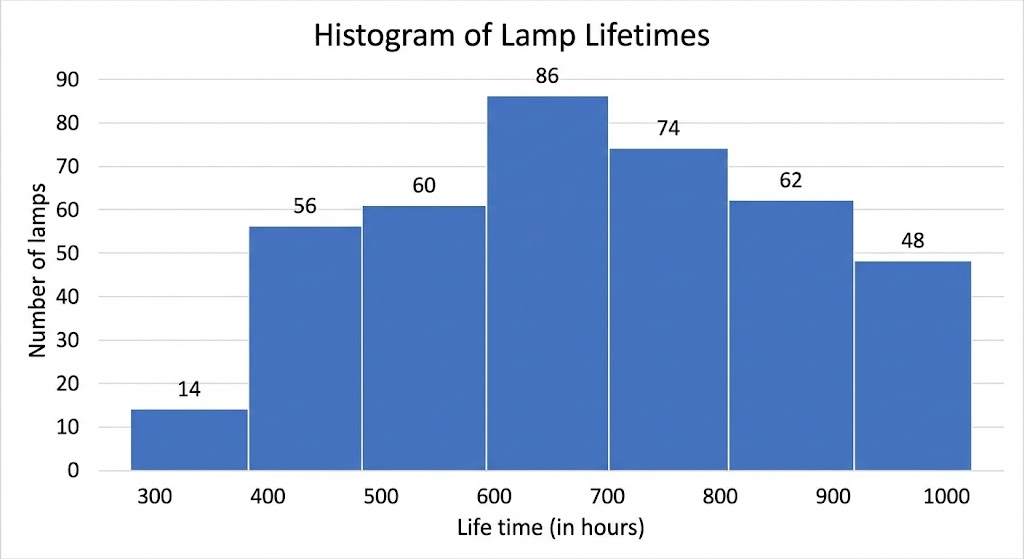
(ii) Number of lamps with life time more than 700 hours: = 74 + 62 + 48 = 184 lamps
Question 6
The following table gives the distribution of students of two sections according to the marks obtained by them:
| Section A | Section B | ||
|---|---|---|---|
| Marks | Frequency | Marks | Frequency |
| 0 – 10 | 3 | 0 – 10 | 5 |
| 10 – 20 | 9 | 10 – 20 | 19 |
| 20 – 30 | 17 | 20 – 30 | 15 |
| 30 – 40 | 12 | 30 – 40 | 10 |
| 40 – 50 | 9 | 40 – 50 | 1 |
Represent the marks of the students of both the sections on the same graph by two frequency polygons. From the two polygons compare the performance of the two sections.
Solution:
First, find class-marks:
- 0 – 10 → 5
- 10 – 20 → 15
- 20 – 30 → 25
- 30 – 40 → 35
- 40 – 50 → 45
We also need class-mark before first class (-10 – 0 → -5) and after last class (50 – 60 → 55).
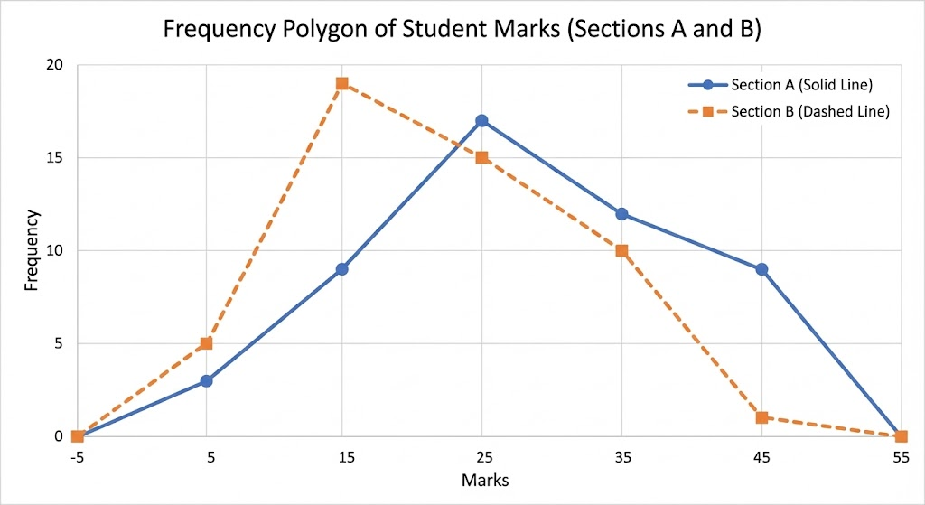
Comparison:
- Section B has more students scoring between 10-20 marks
- Section A has more students scoring between 20-30 marks and 30-40 marks
- Section A has more students scoring between 40-50 marks
- Section A performed better overall as more students scored in higher mark ranges
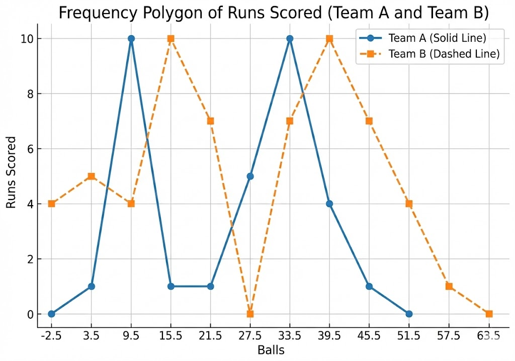
Question 7
The runs scored by two teams A and B on the first 60 balls in a cricket match are given below:
| Number of balls | Team A | Team B |
|---|---|---|
| 1 – 6 | 2 | 5 |
| 7 – 12 | 1 | 6 |
| 13 – 18 | 8 | 2 |
| 19 – 24 | 9 | 10 |
| 25 – 30 | 4 | 5 |
| 31 – 36 | 5 | 6 |
| 37 – 42 | 6 | 3 |
| 43 – 48 | 10 | 4 |
| 49 – 54 | 6 | 8 |
| 55 – 60 | 2 | 10 |
Represent the data of both the teams on the same graph by frequency polygons.
Solution:
First, make class intervals continuous. The gaps are of 1, so we subtract 0.5 from lower limits and add 0.5 to upper limits:
Continuous intervals: 0.5-6.5, 6.5-12.5, 12.5-18.5, 18.5-24.5, 24.5-30.5, 30.5-36.5, 36.5-42.5, 42.5-48.5, 48.5-54.5, 54.5-60.5
Class-marks: 3.5, 9.5, 15.5, 21.5, 27.5, 33.5, 39.5, 45.5, 51.5, 57.5
Also need class-marks before first (-5.5-0.5 → -2.5) and after last (60.5-66.5 → 63.5).
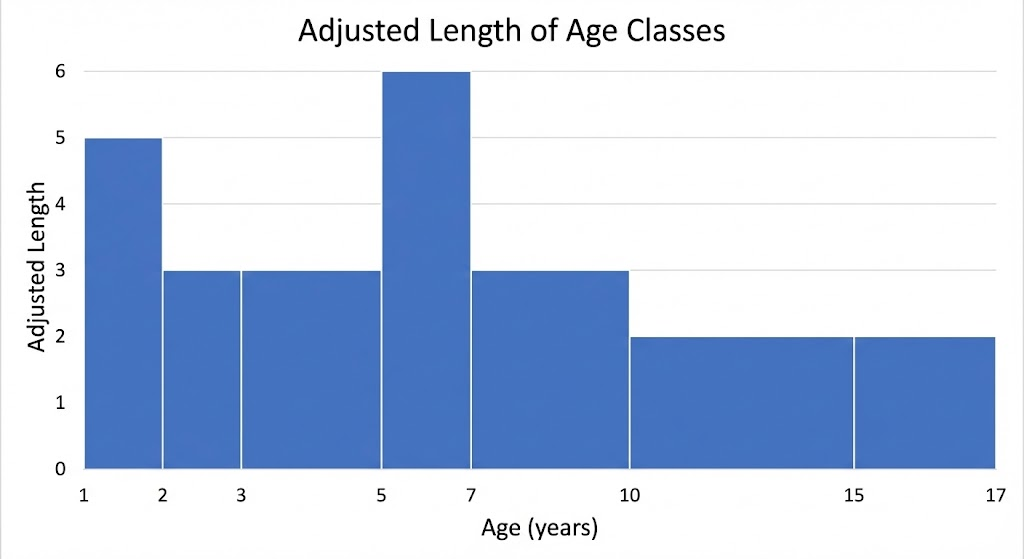
Question 8
A random survey of the number of children of various age groups playing in a park was found as follows:
| Age (in years) | Number of children |
|---|---|
| 1 – 2 | 5 |
| 2 – 3 | 3 |
| 3 – 5 | 6 |
| 5 – 7 | 12 |
| 7 – 10 | 9 |
| 10 – 15 | 10 |
| 15 – 17 | 4 |
Draw a histogram to represent the data above.
Solution:
This data has varying class widths. We need to adjust the lengths of rectangles.
| Age (years) | Frequency | Class width | Adjusted length |
|---|---|---|---|
| 1 – 2 | 5 | 1 | (5/1) × 1 = 5 |
| 2 – 3 | 3 | 1 | (3/1) × 1 = 3 |
| 3 – 5 | 6 | 2 | (6/2) × 1 = 3 |
| 5 – 7 | 12 | 2 | (12/2) × 1 = 6 |
| 7 – 10 | 9 | 3 | (9/3) × 1 = 3 |
| 10 – 15 | 10 | 5 | (10/5) × 1 = 2 |
| 15 – 17 | 4 | 2 | (4/2) × 1 = 2 |
Question 9
100 surnames were randomly picked up from a local telephone directory and a frequency distribution of the number of letters in the English alphabet in the surnames was found as follows:
| Number of letters | Number of surnames |
|---|---|
| 1 – 4 | 6 |
| 4 – 6 | 30 |
| 6 – 8 | 44 |
| 8 – 12 | 16 |
| 12 – 20 | 4 |
(i) Draw a histogram to depict the given information. (ii) Write the class interval in which the maximum number of surnames lie.
Solution:
(i) First, make class intervals continuous. Since the classes are overlapping at 4, 6, 8, 12, we adjust by adding 0.5 and subtracting 0.5:
Continuous intervals: 0.5-4.5, 4.5-6.5, 6.5-8.5, 8.5-12.5, 12.5-20.5
The class widths are varying, so we need to adjust:
| Number of letters | Frequency | Class width | Adjusted length |
|---|---|---|---|
| 0.5 – 4.5 | 6 | 4 | (6/4) × 2 = 3 |
| 4.5 – 6.5 | 30 | 2 | (30/2) × 2 = 30 |
| 6.5 – 8.5 | 44 | 2 | (44/2) × 2 = 44 |
| 8.5 – 12.5 | 16 | 4 | (16/4) × 2 = 8 |
| 12.5 – 20.5 | 4 | 8 | (4/8) × 2 = 1 |
(ii) The class interval in which the maximum number of surnames lie is 6 – 8 letters (44 surnames).
Download Free Mind Map from the link below
This mind map contains all important topics of this chapter
Visit our Class 9 Maths page for free mind maps of all Chapters